I haven't tried this Valentine project, but it looks like it would be a fun one for older grades. I found it here at Art Projects For Kids. Here instructions are easy to follow.
Supplies:
White construction paper
Oil pastels
Ruler

Ideas and resources for Grovecrest Elementary art volunteers.
Showing posts with label oil pastel. Show all posts
Showing posts with label oil pastel. Show all posts
Monday, February 6, 2012
Sunday, January 22, 2012
Winter Cityscape
Supplies:
White or grey construction paper
White oil pastel
Pencil
Blue water color
Paintbrush
I love cityscapes and this project turned out to be really fun. I got the idea from this book (which was one of my favorite Christmas presents this year... that and the awesome art calendar I got from my third grader in Mrs. Guerrero's class. They worked hard on a lot of great art projects).
First, I talked to the class about reflections: where they see them, how they are made, and asked if they have ever seen reflections on a lake or river.
Next, we took a sheet of white construction paper, positioned it horizontally, folded it in half to get a long horizontal crease line in the middle of the paper. We unfolded the paper and drew a thick solid line right on that crease to establish our horizon line. (The horizon line represents where the sky meets the flat earth).
Then we drew a simple cityscape of rectangles and squares rising from the horizon line. (Ask the students to push firmly on the oil pastels to get a good, waxy drawing). We talked about depth and perception and how it looks more realistic to draw the buildings almost as if they were growing out of each other rather than each individually.
*Note, if we'd had grey paper, it would have been easier. The white oil pastel on white paper was a little hard to see. I will work on getting some grey paper in our supply.
After they had drawn buildings, they added stars, a moon, windows in the buildings, and other details.
Next, we folded the paper in half again, and rubbed the back side of the paper with a pencil. They need to rub hard to get the drawing to transfer to the bottom half of the paper. When you open the paper, the drawing should have lightly transferred to the bottom half.
Then, paint the top half of the paper with a dark blue watercolor. The pastel will resist the paint. Next, paint the lower half of the drawing with a lighter blue.


The "resist" reflection showed up better on some than others, but they were still pleased with the outcome.
Tuesday, December 6, 2011
Nutcracker Series
This was a two-week project and the kids loved how it turned out. I used this sketch from Art Projects for Kids and walked the kids through step by step directions of how to draw a nutcracker. I used regular computer paper (8 1/2" x 11") cut in half length wise. They drew the nutcracker on both pieces of paper (thus, a series). Next, they outlined their drawings with thin, black sharpies. This is as far as we got on the first lesson.
Week two: We used watercolors for one of the nutcrackers and oil pastels on the second. Then we pasted them on black cardstock because everything looks better when it is framed in black, right? (I also tried drawing the nutcracker on black cardstock -with white colored pencil, and then colored in with pastels on the black paper. It looked really nice).
The kids were so excited to take these home.


Friday, October 14, 2011
Joan Miro Drawing
Supplies:
Blue paper
Black Sharpie pens
oil pastels
Today, the third graders learned about the artist Joan Miro and looked at his painting,
People at Night, Guided by Phosphorescent Tracks of Snails

First, I walked around the classroom showing each child the painting above (you could print this online. This print is not available in the library). We talked about what they saw in the painting. First they made comments like, "Nothing. Scribbles." But then as they looked closer they saw, "a moon, spiderwebs, a face, shapes, etc."
Then we talked about surreal art and how it looks to create something not realistic. Next, we talked about Joan Miro and I shared a few facts from his life, including that he has works of art dating back to when he was 8 years old. (The kids thought that was pretty cool).
As we started, I told them they would get to have a lot of creativity on this project, but one rule is, once they start drawing (with a black sharpie), they couldn't take their pen off the page until they filled the whole sheet with lines, squiggles, designs, and doodles. If they felt like they made a mistake, I told them to just make it into a design. After they filled the paper with the initial black lines, then they could go back in with the pastels or black marker and add details like eyes, teeth, coloring in shapes, etc.
This was an easy project and a great one to start the year with as we discussed how everyone creates different art, and it doesn't matter how one person's looks compared to another. Art is art no matter what other people think of it. (A great comparison is Miro's above to the Mona Lisa and point out how different they look, and yet they are both famous works of art).


I think this lesson boosts confidence in their ability to make something look great and they had a lot of fun with it. (I got this idea from the Usborne book My Very First Art Book).
Saturday, March 26, 2011
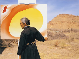
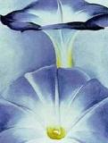
Georgia O'Keeffe Lesson
Age: K-3
Supplies: Paper, Oil Pastels
This was an easy project (no prep and minimal clean up!) with fantastic results. First we talked about the artist Georgia O'Keeffe and looked at pictures of her flower artwork (I printed these from the Internet).


 (I love this one. The student told me it was a venus fly trap).


Supplies: Paper, Oil Pastels
This was an easy project (no prep and minimal clean up!) with fantastic results. First we talked about the artist Georgia O'Keeffe and looked at pictures of her flower artwork (I printed these from the Internet).

The only rules for the project were as follows:
1. They had to draw a HUGE flower with petals that touched the edges of the paper.
2. The could color and design the flower any way they wanted, but the background color was to be one solid color.


We used black paper and oil pastels. I think it would also look great on white paper with colored pencil flowers and watercolor background.
Saturday, October 23, 2010
Howling Houses Lesson

Yesterday I got to teach Miss Cook's 2nd grade class. We did a lesson called "Howling Houses" that I found on the Arts and Activities website. (I recently found this website and it is awesome. They offer full lesson plans with lots of fun ideas). You could adapt this lesson for any age group.
As our lesson began, I played a scary music CD in the background. The music was a big hit with the kids. They would have thought anything was cool at this point. Then we looked at pictures of haunted houses and talked about the colors used and the mood they create.
Walter Wick's On a Scary Scary Night is a great place to start. We also looked at paintings by the artist Charles Burchfield.


(I printed these from the internet)
The prints below would also be great visual aids on this topic and are available in the Grovecrest Library:

El Greco's View of Toledo

Van Gogh's Starry Night
As we discussed mood, we also talked about cool vs. warm colors and how they affect the way you feel. I asked the students to tell me how the paintings make them feel, what elements specifically create these feelings, and what details they would expect to see in a haunted house (cracked roofs, jagged edges, moon, stars, bare trees, etc.)
You could use many different mediums for this project. I choose oil pastels against black paper but colored pencils, paint, or even crayons would work well. I steered the students away from blood and ghosts, and tried to focus on just the house. I also asked them to stay within cool colors for their palette.
They loved the outcome.


I would love to hear what lessons you are using and how they are going. If you'd like to share them with us, please email us at grovecrestart@gmail.com
Subscribe to:
Posts (Atom)